Mobile Carousels
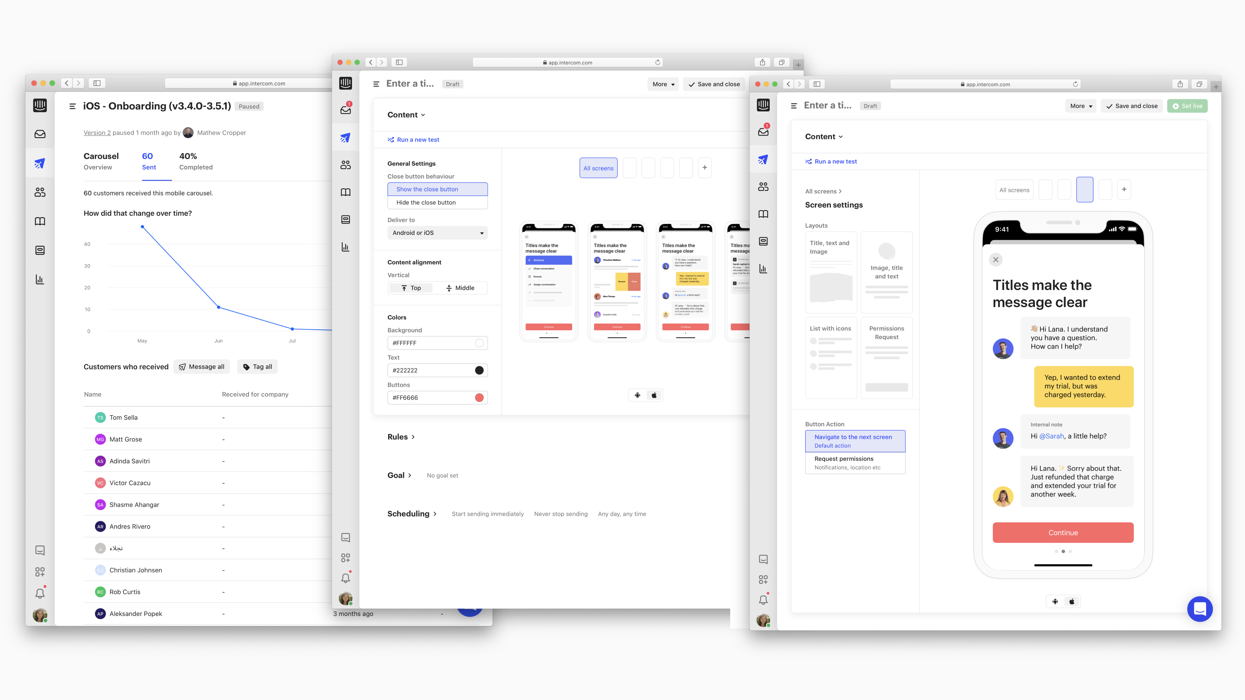
Mobile Carousels is a customizable way to reach, engage, and support customers on mobile. On a teammate side, it offers a no-code message builder with different per-screen layouts and full message templates. As it's built on top of the Intercom, it leverages the power of the platform with sophisticated audience targeting, personalization and A/B testing.Context
In summer 2019, we launched Product Tours which allows you to create a pointer style onboarding flow on a website. You can walk a new user through your product and show them all kind of things they can do. It was really popular, but literally the next day after the launch we started getting feedback from people saying 'Can we have this feature on mobile?'. So we didn't build it.Instead of going straight into building it, we took the time to understand the problem that our customers were having and the reason why they thought this (same feature on mobile) would be a solution.
We started with a problem, which is one of the driving principles we have in Intercom. Probably a hundred of hours have gone into talking to customers, thinking about the problem and understanding it. So we had feedback from our customers, we did customer interviews, spent time looking at how customers were using our existing features.
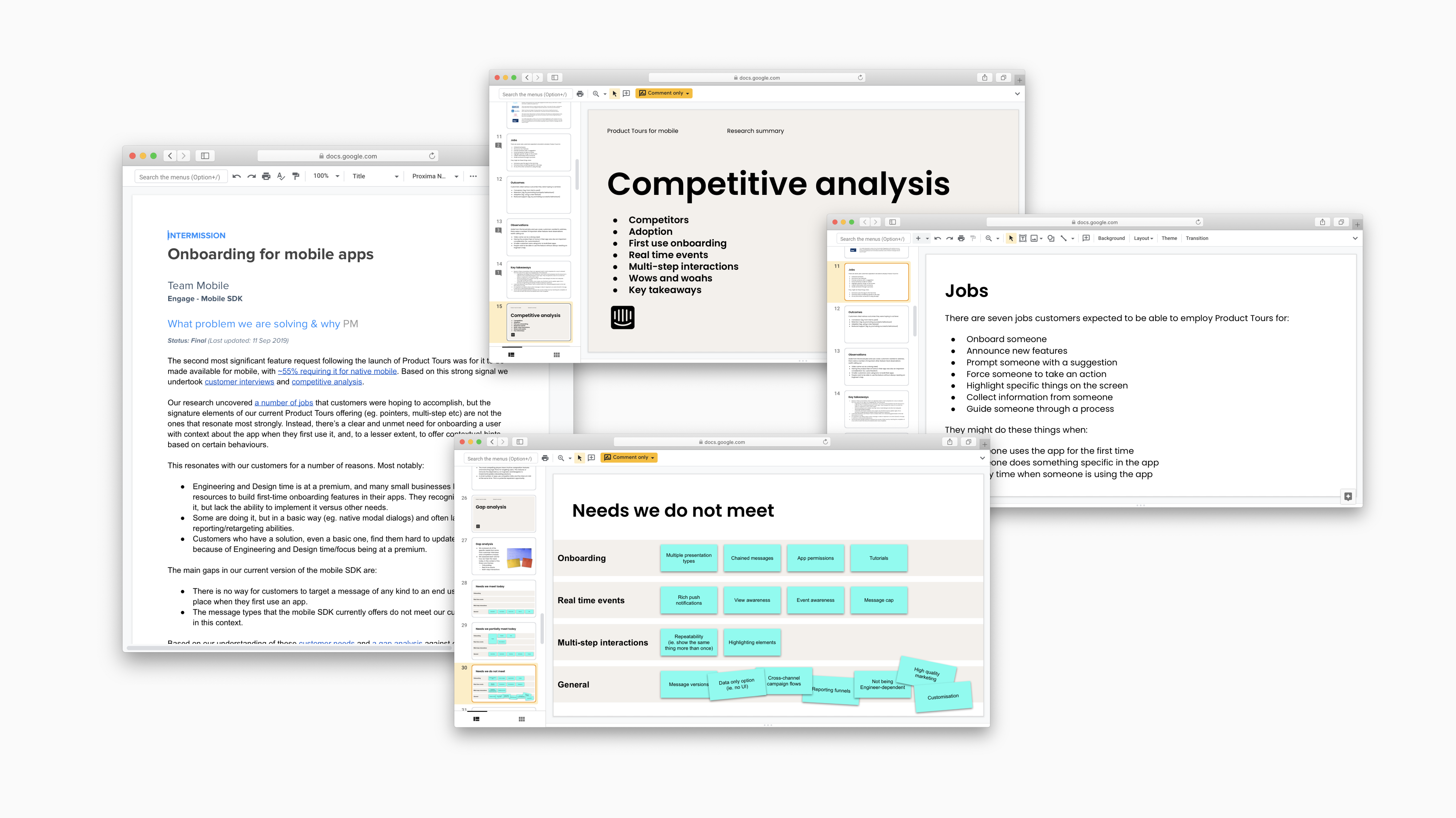
Problem
We learned a lot. The reason why customers were asking for the feature is that they had five main problems they were trying to solve:- They wanted to be able to retain customers better (e.g. promoting successful behaviours early on, so that people know the things they should do to achieve their goals in the app).
- They wanted to reduce the impact on their support teams (because they were getting lots of similar questions that were avoidable, i.e. sort of obvious questions people kept asking over and over).
- A lot of customers' mobile apps are not complex. They wanted a good and simple onboarding experience for new app users with no advance capabilities.
- Customers didn't know how to do a great onboarding experience. They were a little bit afraid they couldn't figure out what good experience even really look like.
- Most of them were blocked from doing the feature themselves by lack of Engineering and Design time. For those who built the feature themselves, updating it wasn't easy and swift and required engineering and design resources.
Process
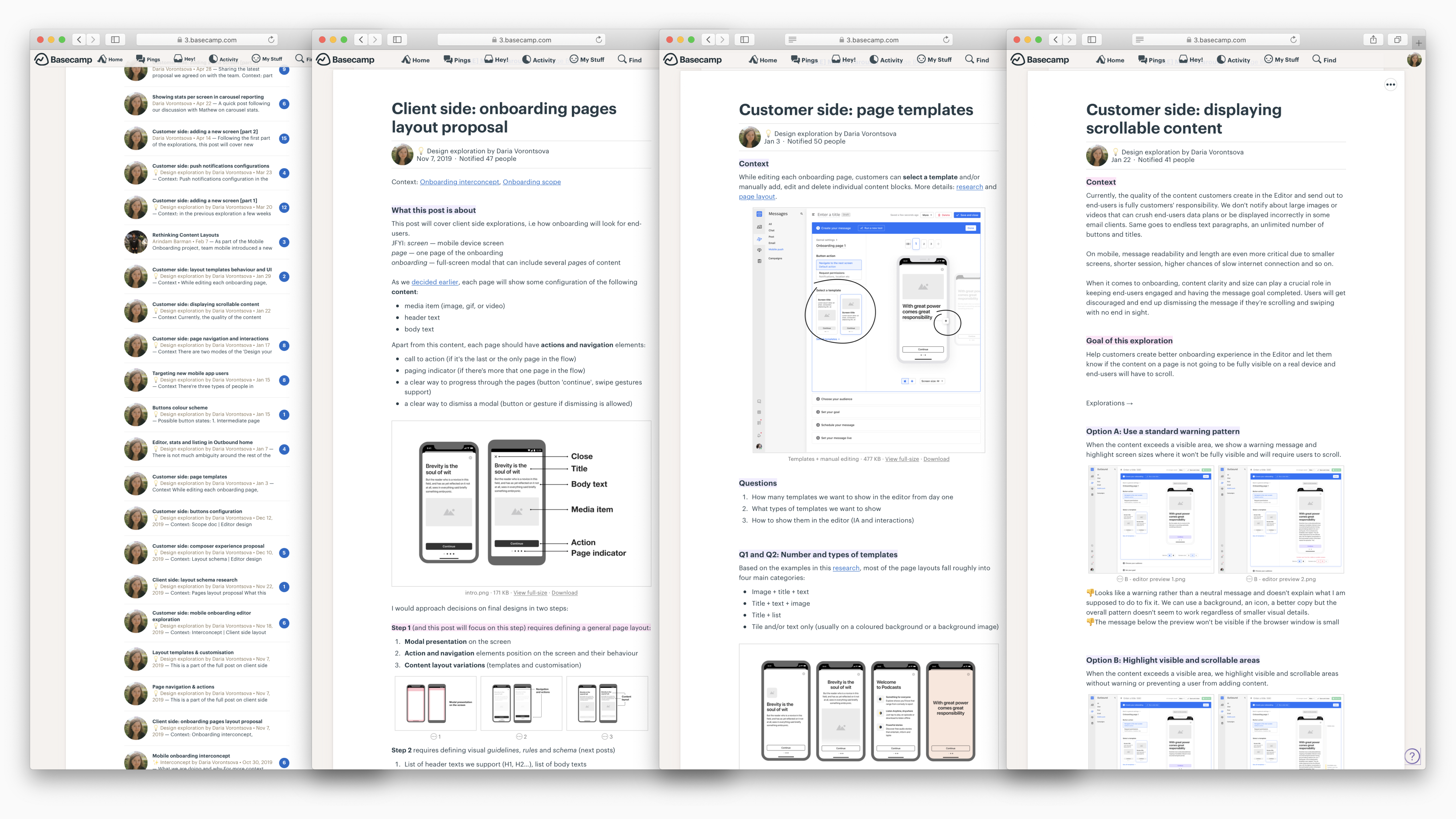
After gathering all the inputs, we understood that we could help people achieve their jobs without doing a super big and complex feature (like Product Tours on the web), so we decided to go with a simple carousel-style message that pops up when a user uses the app for the first time. From here, we started to explore different ways we might design and build our solution.In Intercom, we use Basecamp to share all design work. It took us around three months of design, iterations, prototypes testing, close collaboration with PM and the team to get from a highly ambiguous concept with lots of open questions to a solid design proposal.
Research & Testing
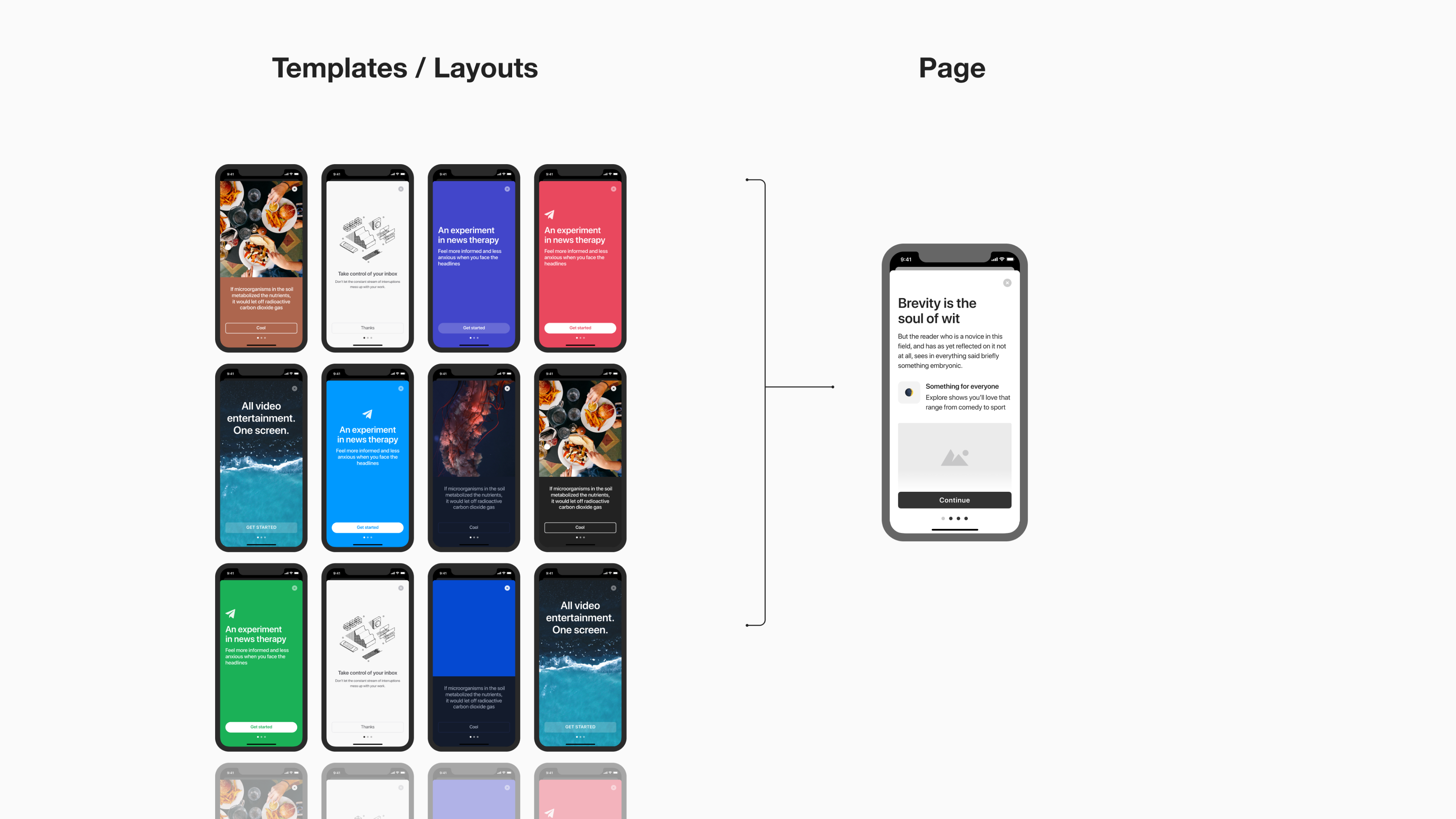
I spent a fair bit of time looking at the onboarding flows in hundreds of different apps. It was clear that people are doing mobile onboarding in a recognizable and intuitive way using a carousel-style onboarding on first app launch.And I went from the idea of what it might look like and started looking at different apps in the wild and asking ourselves 'If we had a no-code mobile onboarding builder, could we (in theory) replace what they already have with our feature?'. To answer this question, I made screenshots of carousel-like onboardings in around 50 different popular apps and recreated them using the concept we came up with. On the right is our concept, and on the left is a real app:
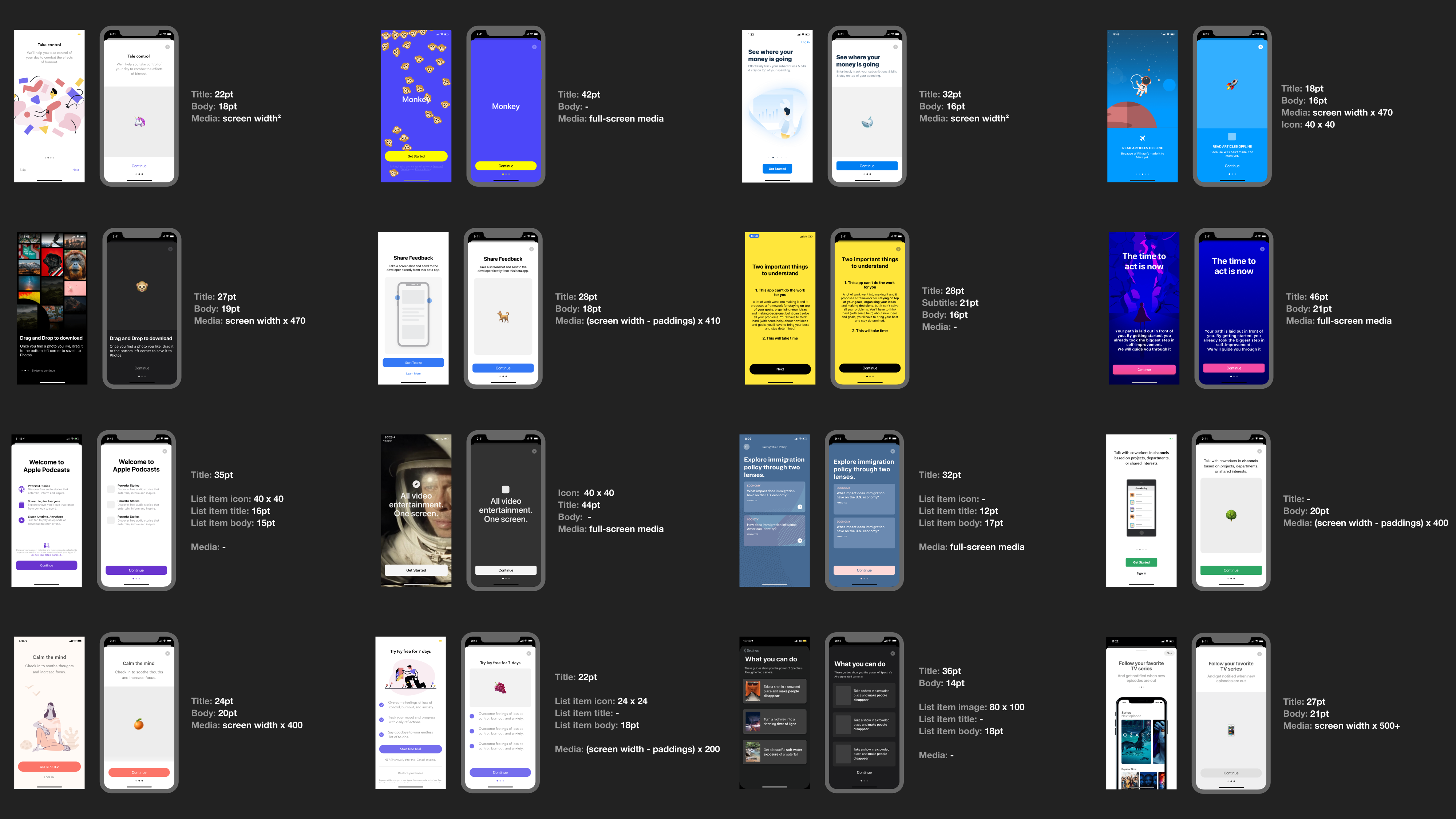
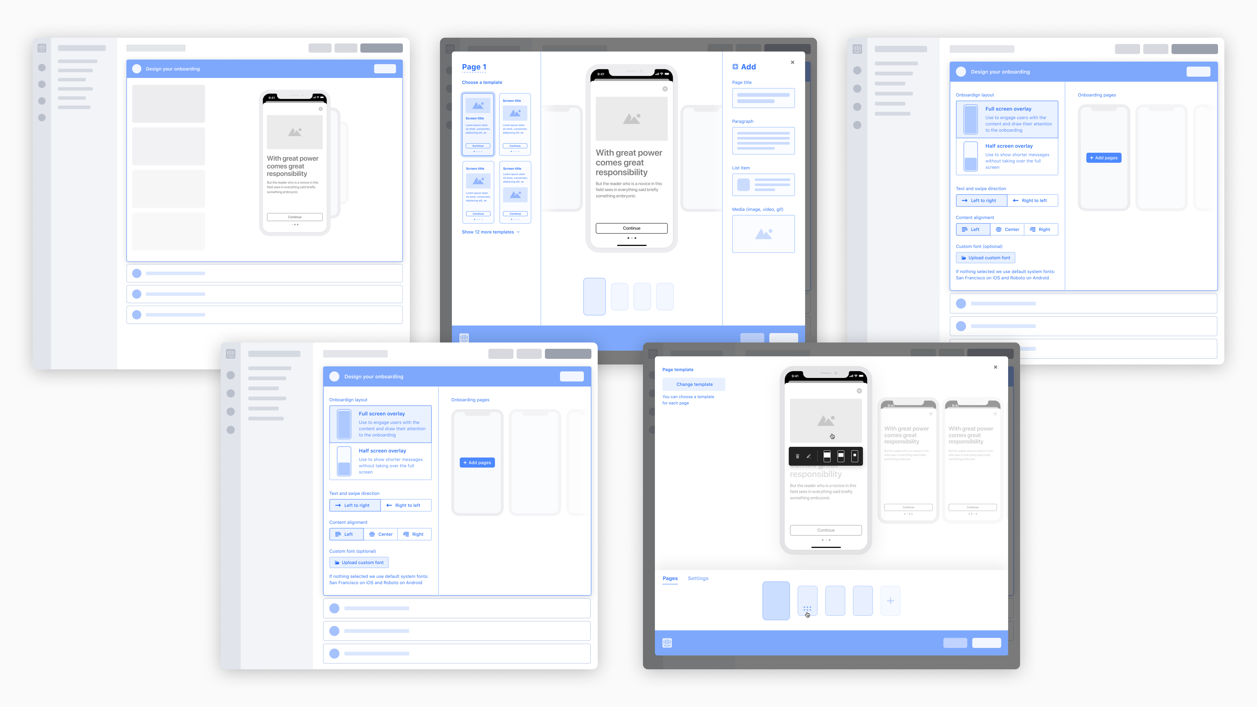
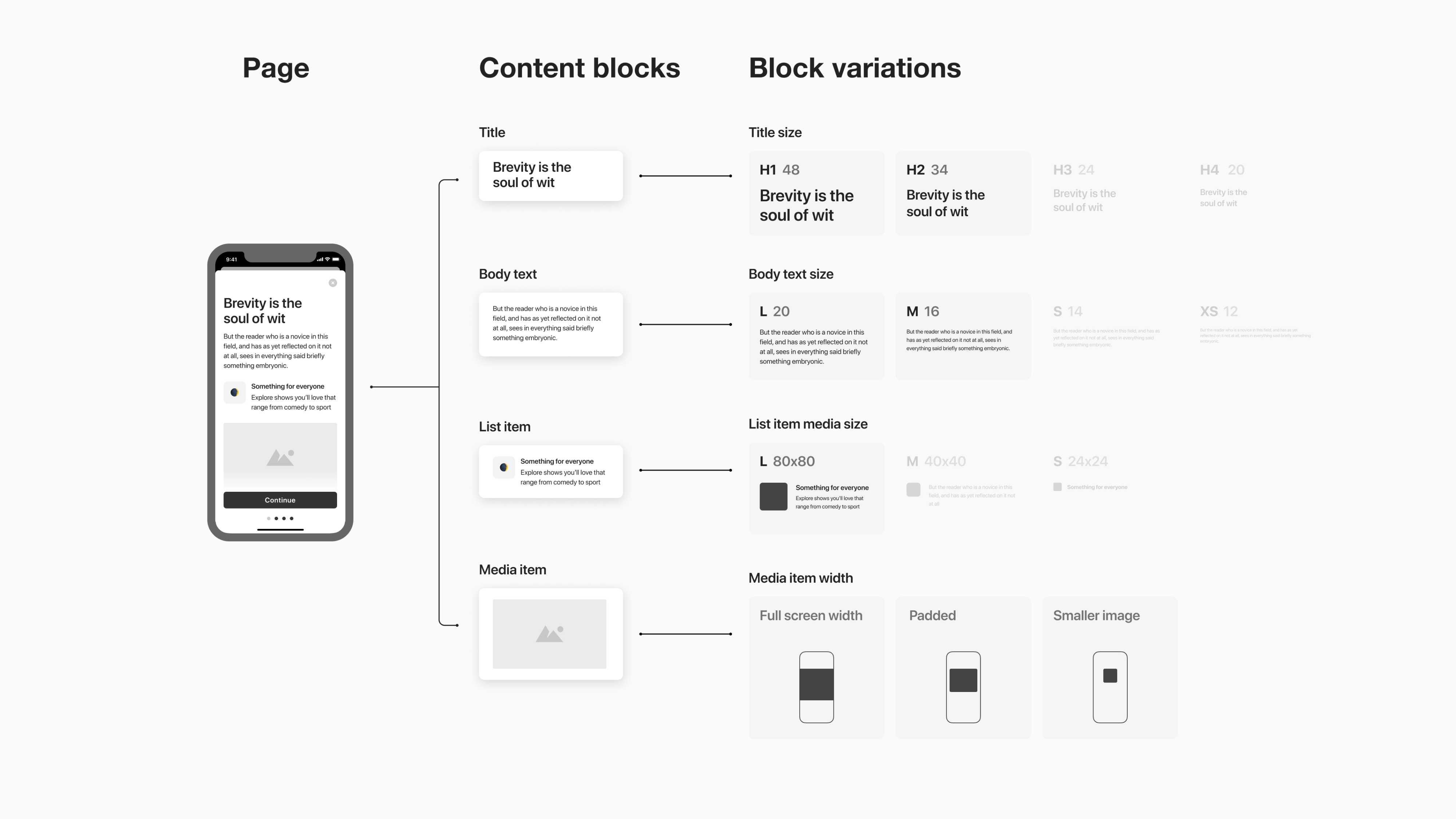
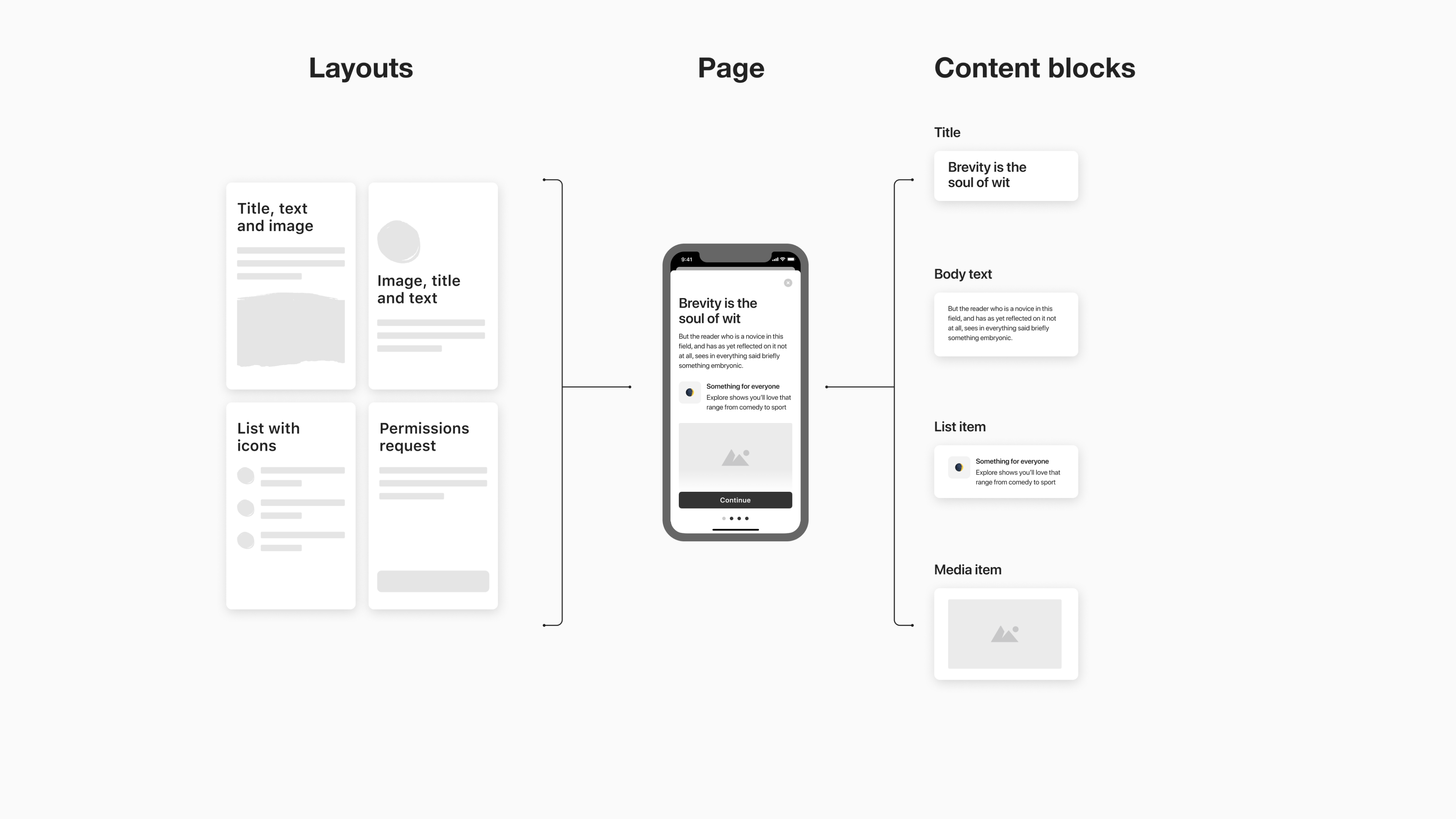
The exercise helped not only to test the concept but also understand how much customization we want to offer and narrow down the first scope. It turned out that all different layouts and styles consist of similar blocks (title, body text, media item, button, etc.) that don't vary too much in terms of size and style. For example, half of the real onboarding examples were using the same font size for a title (34pt) and a filled square button.
One of the challenges we face when building features is time and resources. Back at that time, our team had two iOS engineers, one Android engineer and one web (Ember) engineer. We had to be extremely thoughtful when planning the first scope and find the right balance between releasing the product fast but descoping half of critical features and spending a year building all those nice-to-have features that are not going to be used much.
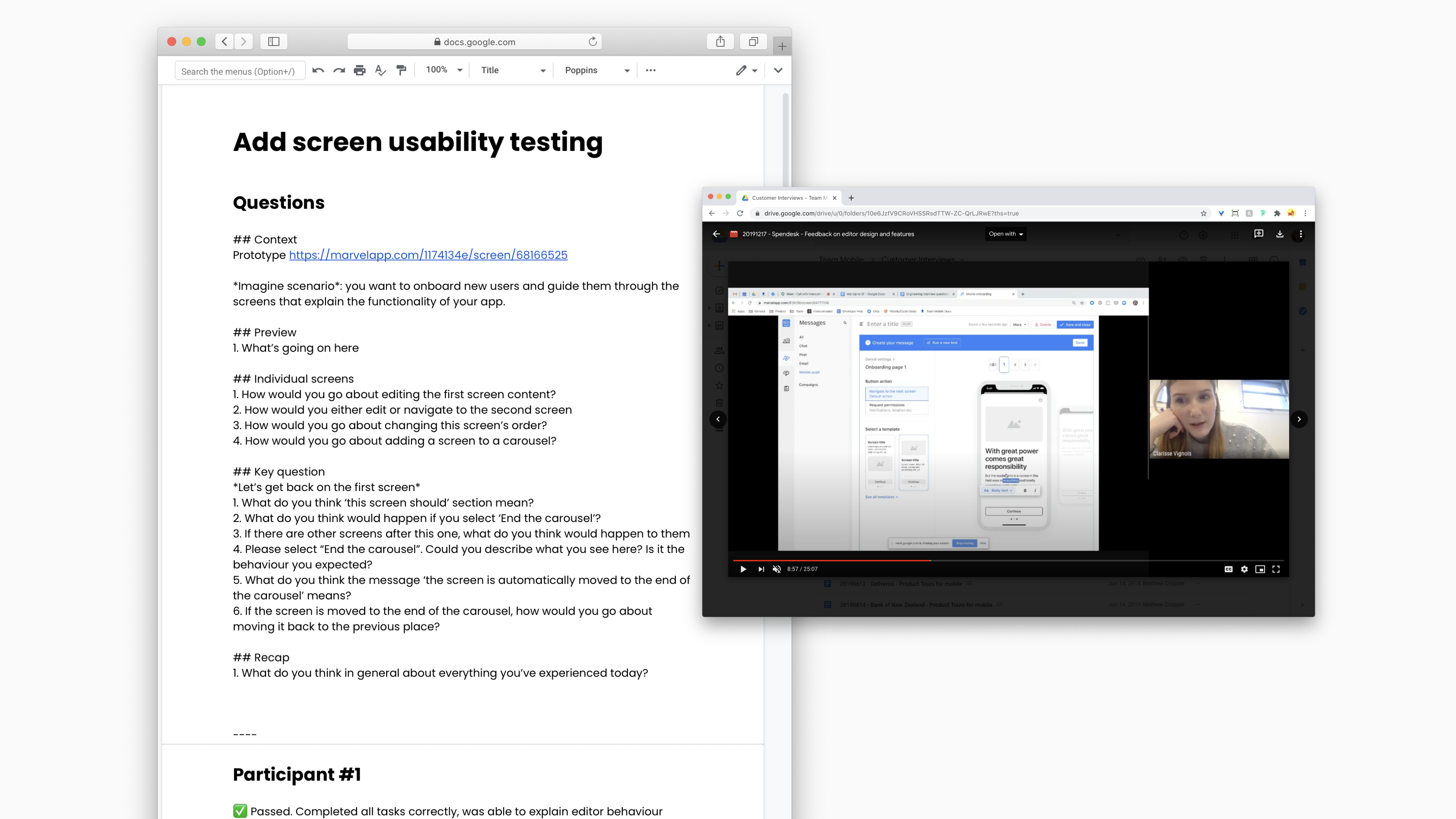
When we aligned on an initial scope, I made a few prototypes of both customer-side interface (no-code builder) and a client-side flow (how it's going to look on an end-users' mobile device). We went to a series of testing sessions with customers trying to understand whether the functionality we were offering would be enough to cover their main needs.
When we aligned on an initial scope, I made a few prototypes of both customer-side interface (no-code builder) and a client-side flow (how it's going to look on an end-users' mobile device). We went to a series of testing sessions with customers trying to understand whether the functionality we were offering would be enough to cover their main needs.
Result
We ended up rethinking the way we're rendering content in our SDK. Intercom mobile SDK is a thing you embed in a mobile app that gives you mobile features, including in-app messages and the carousel that we were building. We made changes in the SDK to support backwards compatibility, which means instead of sending down stuff and rendering a layout in the app this is all being done server-side and being passed down to the client and rendered in real time. It also means that as we have much more information that's coming down from a server, we can do more complex layouts, and when we introduce new ones in the future, they'll be backwards compatible back to the first version.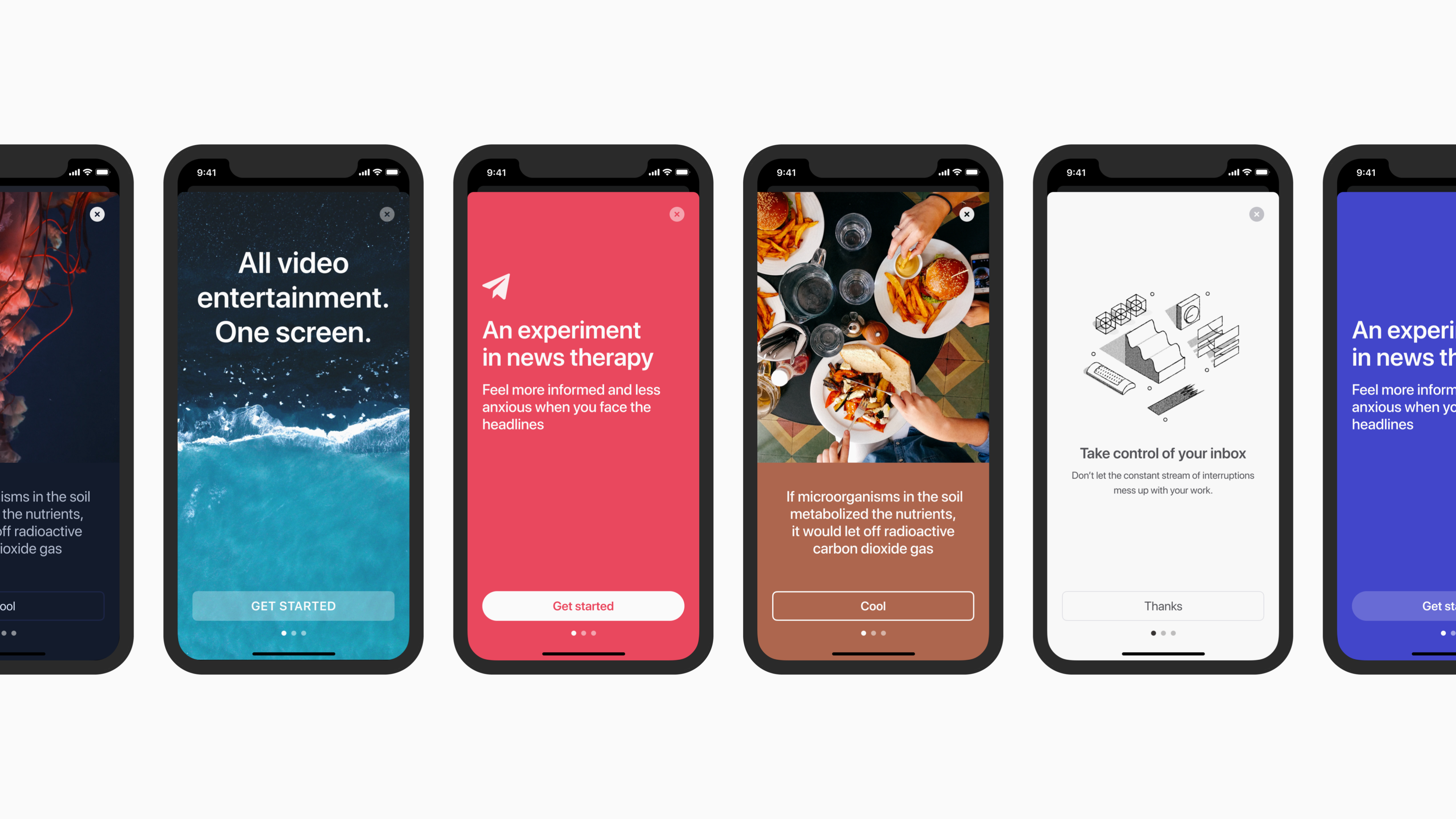
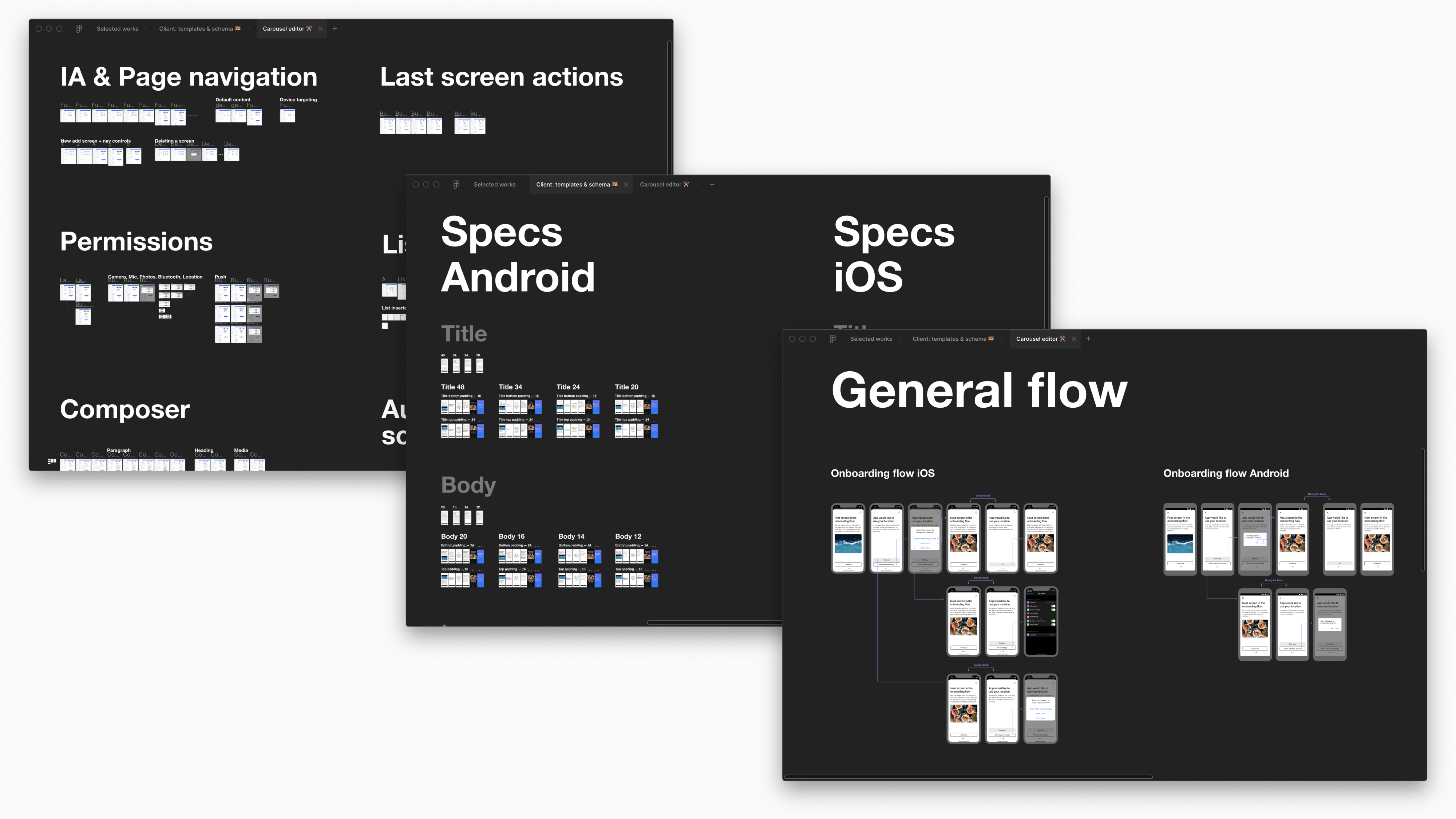
A composition side of things (no-code builder) is as essential as the end-user experience. We wanted to make it easy for people to be able to create the onboarding experience and do it really well, and also give them a helping hand (for example, notify if the content is going to scroll) but not being too prescriptive.
Learning
We learned a bunch of things building the feature:- The quality bar for SDK is hight. Once you release it and it gets into customers' apps, it's really hard for us to get them to update it.
- Investing in early alignment and scope discussion pays its dividends. Having engineers involved in the process, sharing designs and ideas to get feedback helped us move faster and work more efficiently.
- Speed is everything. We've put a lot of effort into how we optimize the time for the carousel message to appear in the app (because technically when an end-user opens an app, we have to call Intercom to get the message come from a server and render it in an app in a fraction of a second).
- Sometimes it makes sense to build the same thing on mobile and web and sometimes it doesn't. If we hadn't spent the time digging into customers' needs and problems, the feature wouldn't have been adopted that well.
Today, when the feature is already out, 46% of our target customer segment is using it (which is a lot). Over three months following the launch, the total number of times end-users have opened mobile carousels created by our customers is ~700K.